Crafting a Better Experience: Ribblr’s Redesign and Rebranding

About: Ribblr is a pioneering platform in the crafting world, offering an interactive experience for users to create, share, and explore a diverse range of crafting patterns, including crochet, knitting, sewing, and tunisian crochet. Aiming to revolutionize the $100B+ crafts industry, Ribblr aspires to be the go-to destination for crafters worldwide.
Challenge: The existing crafting platform had an engaged community but struggled with usability issues, making it difficult for users to navigate, find patterns, and interact with creators. The lack of personalization, cluttered UI, and inconsistent design elements led to friction in the user experience.
Approach: We redesigned the platform with a user-first approach, simplifying navigation, improving pattern discovery, and enhancing shop management tools for creators. A cleaner interface, personalized recommendations, and interactive features made the platform more intuitive and engaging. The result is a seamless, community-driven experience that encourages exploration, creativity, and connection.
“We’re thrilled with the improvements made to the Ribblr platform. The team’s ability to uncover key insights really helped in addressing critical usability challenges. The updated design has truly elevated the platform, aligning it with Ribblr’s mission to lead the crafting community.”


Design Process
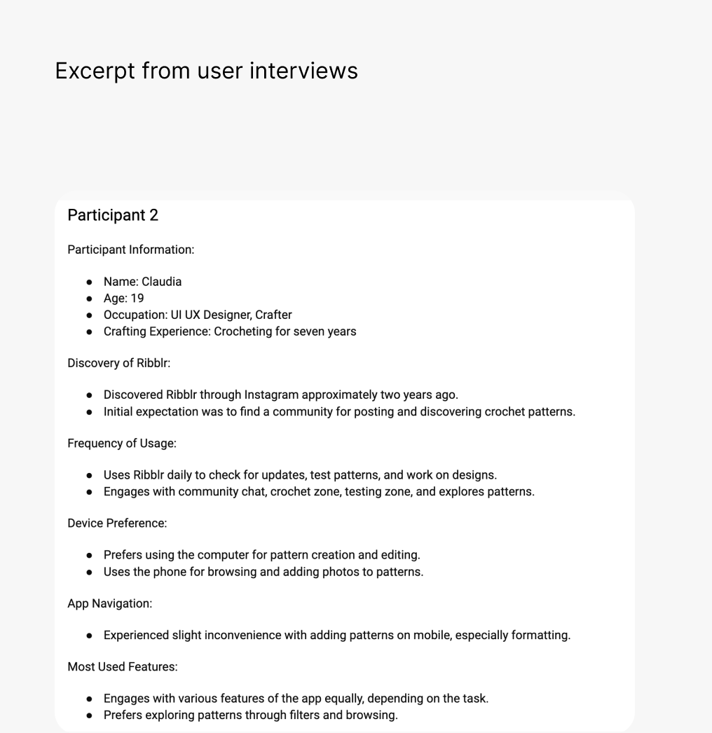
Starting with a design audit of the existing platform, we conducted extensive user interviews and testing to identify pain points. The insights guided improvements in UX and UI. While branding was developed by the in-house team, we integrated it into the new design system and high-fidelity screens, creating a more seamless experience.
Research & Exploration
Design & Prototyping
Branding & Web Design
Research & Exploration
We started by analyzing the platform’s existing usability challenges and gathering user insights through research. Understanding crafters’ workflows and pain points helped us define key improvements. The focus was on making pattern discovery effortless, improving shop management for creators, and ensuring a consistent visual experience.


Wireframing & Iterations
To refine the user journey, we created low-fidelity wireframes, tested early concepts, and iterated based on feedback. We focused on structuring the navigation, improving the browsing experience, and simplifying interactions for both buyers and sellers. Continuous testing helped us validate design decisions before moving into high-fidelity UI.

Before & After
The original design had usability challenges, such as complex navigation, lack of hierarchy, and inconsistent layouts. Through a structured redesign, we introduced a cleaner, more organized interface, intuitive patterns and material pages, and a more engaging shop experience. Visual improvements enhanced readability and interaction, making the platform more inviting and user-friendly.


Features
Home page
The homepage was redesigned to be more dynamic and personalized. It now showcases curated content, trending patterns, and user recommendations, creating an engaging first touchpoint. The new layout ensures easy access to key features while keeping the experience visually appealing.

Sales & For You
We introduced a personalized “For You” section that tailors recommendations based on user preferences. The updated sales section highlights discounts and exclusive offers in a visually structured way, ensuring users don’t miss important deals.


Search and Filtration
To simplify content discovery, we enhanced search functionality and introduced better filtering options. Users can now find patterns and materials by skill level, popularity, and category, making the browsing experience faster and more efficient.

Pattern Page
The pattern pages were redesigned for clarity and engagement. We improved the layout for better readability, added quick-access information like difficulty level and required materials, and enhanced visuals to showcase designs more effectively.


Patterns / Instructions
Instead of static PDFs, the new experience offers interactive patterns with step-by-step guidance. The improved UI allows users to track progress, zoom in for details, and follow instructions with ease, making crafting more intuitive.


Reviews and makes
We introduced a structured reviews section that allows users to share their finished projects and feedback. This not only helps others in their purchasing decisions but also fosters community engagement by encouraging interaction and showcasing user creativity.

Materials
A dedicated materials section was designed to help users find and purchase crafting supplies efficiently. The improved categorization and search filters ensure users can quickly locate the materials they need for their projects.


My Stuff
To keep personal content organized, we created a centralized space for saved patterns, materials, and past purchases. This makes it easier for users to access their crafting history and revisit favorite items.

My Shop
For creators selling their patterns, we optimized the shop experience. The new design provides clear shop customization options, better product visibility, and improved management tools, making it easier for sellers to grow their business.

Tips
To encourage creator support, we added a tipping feature with playful visuals and interactive elements. Users can now show appreciation for their favorite designers, creating a more rewarding ecosystem for makers.

Shop Manager
A redesigned dashboard offers shop owners a clear overview of their sales, analytics, and orders. The streamlined interface allows them to manage listings, track revenue, and optimize their shop performance effortlessly.


Paid Membership
We designed a structured membership page showcasing three subscription tiers—Starter, Gold, and Platinum. Each tier clearly outlines its benefits, helping users easily compare options. Key features like premium pattern freebies and seller perks were highlighted to increase engagement.

Help Center
To enhance user support, we created a friendly, accessible Help Center with live search, categorized topics, and quick navigation. A “Still Need Help?” section ensures users can easily reach out when needed.

Empty states
Instead of blank screens, we introduced playful empty states with quirky icons and actionable prompts. This keeps users engaged even when they haven’t interacted with certain features yet, turning empty pages into moments of discovery.

Dark mode
Recognizing that many users browse in low-light environments, we designed a Dark Mode option to reduce eye strain and improve accessibility. The high-contrast interface ensures readability while maintaining the platform’s aesthetic consistency.


Have a project in mind?
MORE CASES
Designing a Generative AI Applications Software Platform


Redesigning B2B Platform for Seamless Delivery Management
