

Contact us


Tango Travel - Ukraine 🇺🇦
Modernizing the Tour Booking Experience
- Industries: Travel & Tourism, Booking
- Platforms: Web (Desktop & Mobile)
- Services: UI/UX Design, Branding, Marketing Assets
About: Tango Travel is a leading travel agency in Ukraine with over 12 years of experience, offering tours to more than 35 countries worldwide.
Challenge: The agency sought a fresh rebrand and an improved user experience to captivate a new target audience and modernize their digital presence
Approach: We conducted in-depth user research, uncovering key audience pain points and opportunities for enhancement. The result was a visually compelling and intuitive website, with optimized user paths and a revitalized brand identity.



Julia Bazhovska, Founder of TangoTravel
“Working with Efficy was a great experience. They understood our audience and transformed our brand and website into something modern, intuitive, and engaging. Their clarity in UX and creativity in design helped us refresh our digital presence and better connect with younger travelers.”



Design Process
We followed a structured process to ensure the best user experience. First, we conducted pre-sale research to understand the business goals and technical constraints. This was followed by in-depth user research, identifying the core audience and mapping an improved user flow.
Branding played a key role in shifting the company’s visual identity to a more mature and trustworthy look, while still retaining a touch of friendliness. Finally, we moved into prototyping, testing, and refining the final UI based on user feedback.


1.
Research & Exploration
- Stakeholder interviews
- Business research & competitor analysis
- User interviews
- User modeling & journey mapping
- User flows
- Low-fidelity wireframing


2.
Branding
- Visual direction exploration
- Client testing & discussions
- Final selection & branding guidelines


3.
Design & Prototyping
- High-fidelity screens
- Interactive prototypes
- Design system creation
- Ongoing collaboration with stakeholders & developers

Research & Exploration
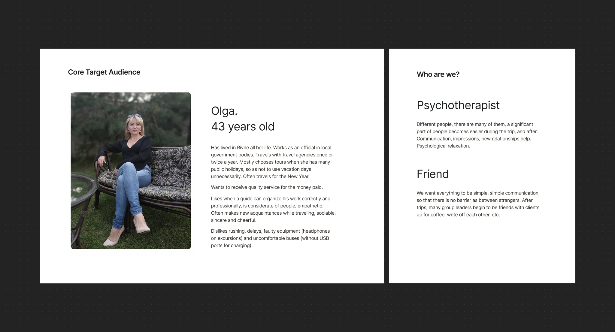
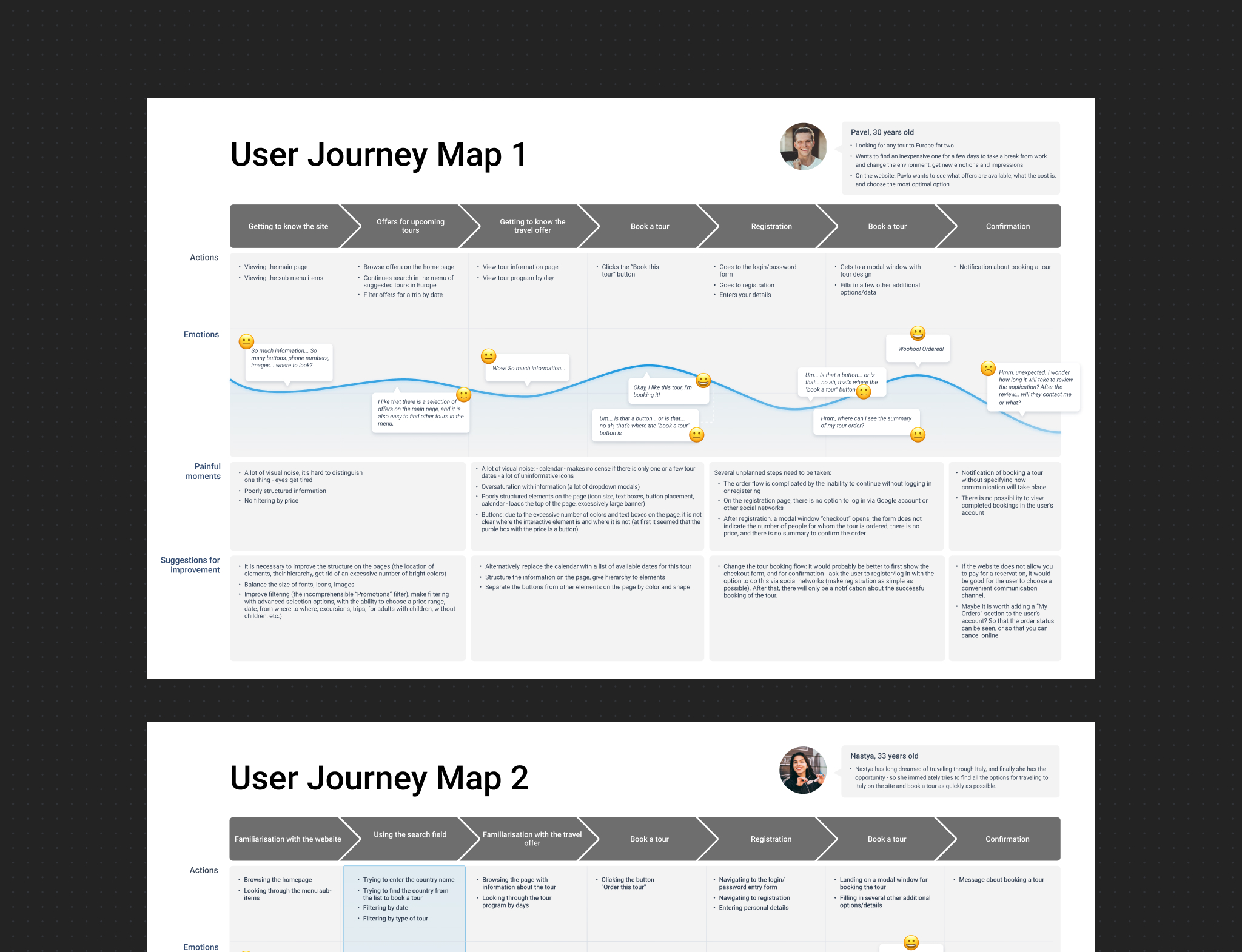
Through our research, we discovered that Tango Travel’s primary audience was not “everyone,” but predominantly users aged 30–45, whose priorities centered around trust, clarity, and reliable guidance. This finding contrasted sharply with the platform’s previous festive visual style, which didn’t align with their expectations. By mapping the user journey and identifying pain points in the booking flow, we gained clear direction on how to refine both the visual language and overall user experience, making the platform more trustworthy, focused, and intuitive.
Wireframing & Iterations
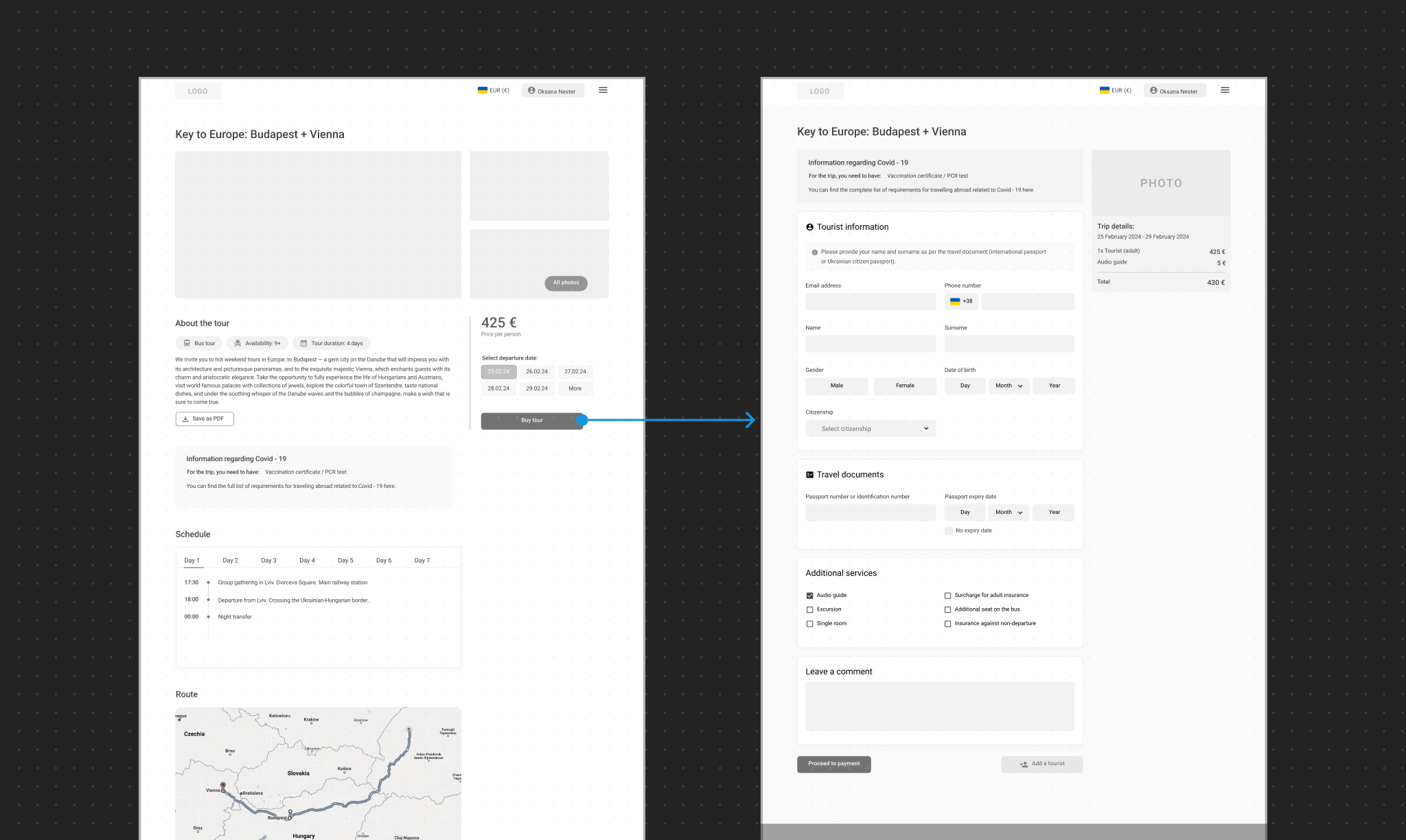
The wireframes provided a structured foundation for the new design, and new functionality, focusing on intuitive navigation, streamlined booking flows, and clear content presentation. By testing and refining these early-stage layouts, we ensured a user-friendly experience, reducing friction in the booking process and making it easier for customers to find and book tours efficiently.
Before & After
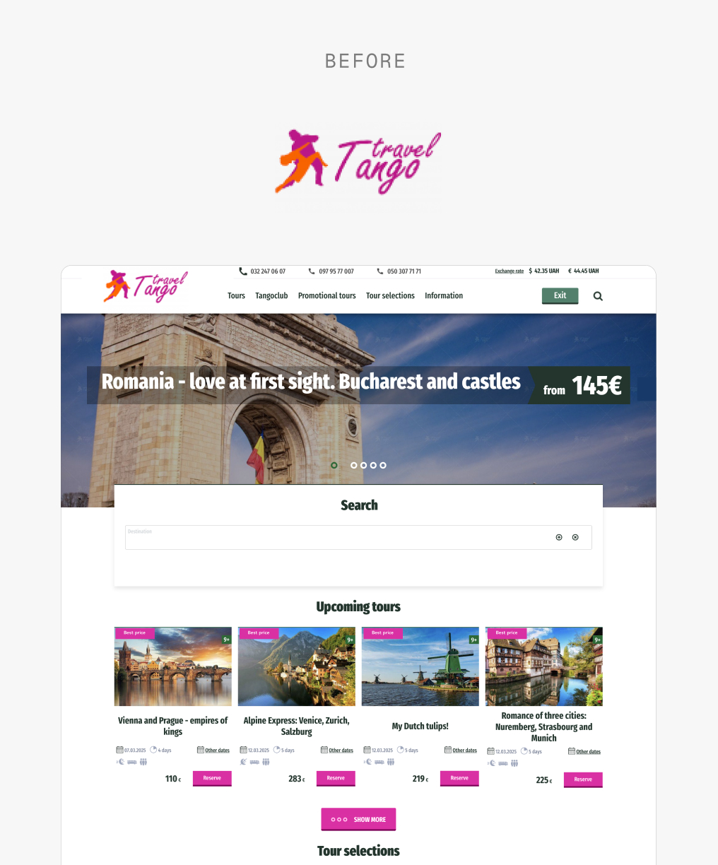
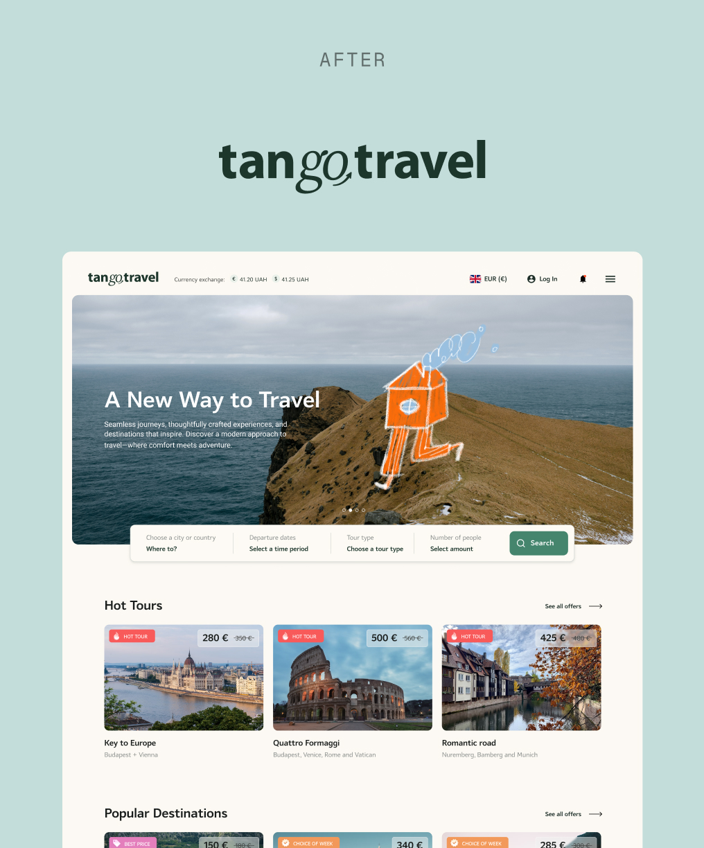
The previous branding featured two dancing figures—vibrant and festive but lacking professionalism. We refined the identity with an elegant calligraphic typeface, creating a modern yet inviting look. To maintain warmth, we introduced custom illustrations across the website and marketing materials, ensuring both clarity and usability remained a priority.
From a user experience perspective, the redesign improved visual hierarchy and readability, making key information easier to scan. The refined color palette and structured layout enhanced trust and accessibility, ensuring users could navigate the platform effortlessly while still feeling engaged with the brand's personality.
Pages & Features

Registration
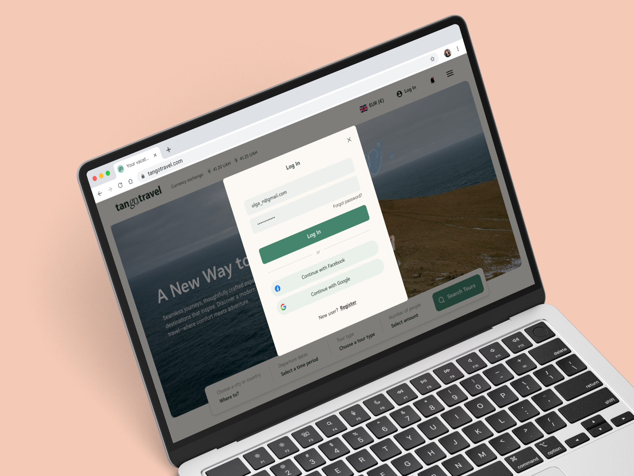
Previously, the full-page registration process felt overwhelming. We streamlined it into a modal window, allowing users to sign up without disrupting their flow. This small but effective change significantly improved usability and encouraged more registrations.
Main page
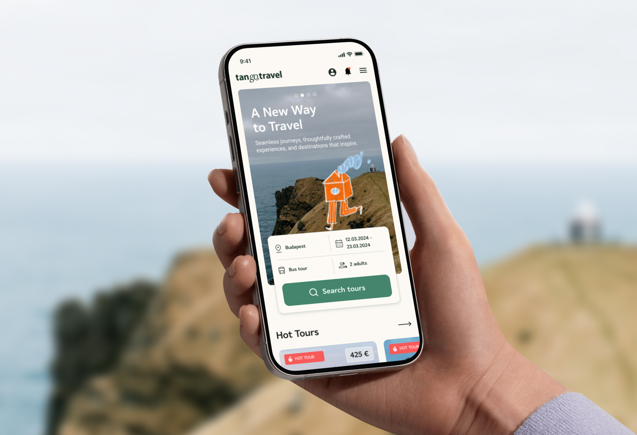
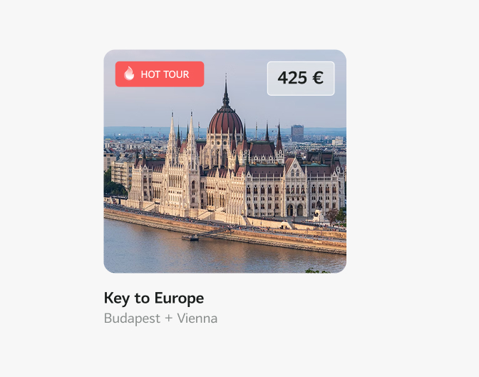
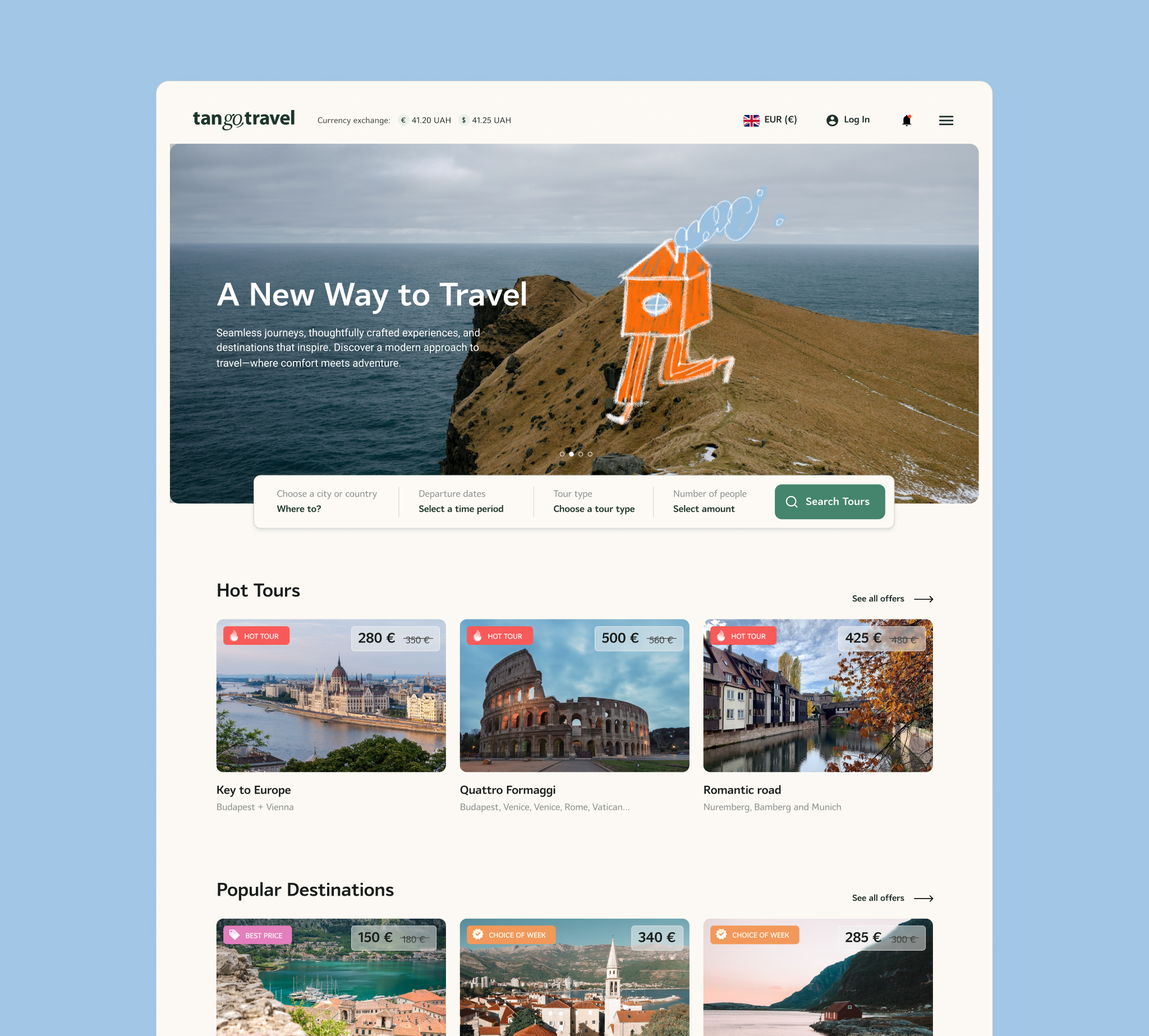
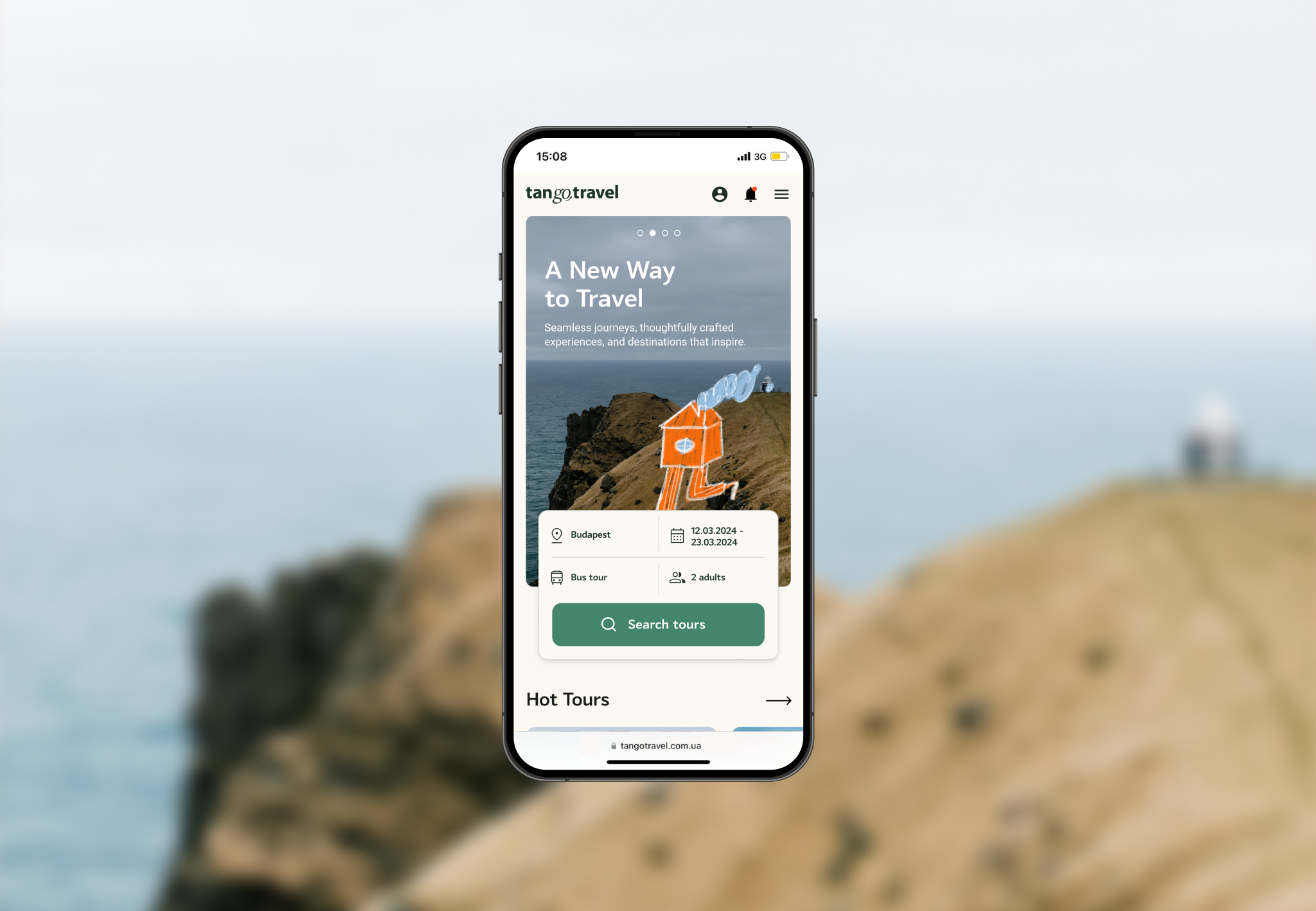
The redesigned main page balances aesthetics with usability. A clean layout and intuitive navigation create an inviting first impression, while a dynamic promo banner highlights top destinations. The improved searach function helps users find tours quickly and efficiently.
Search Results
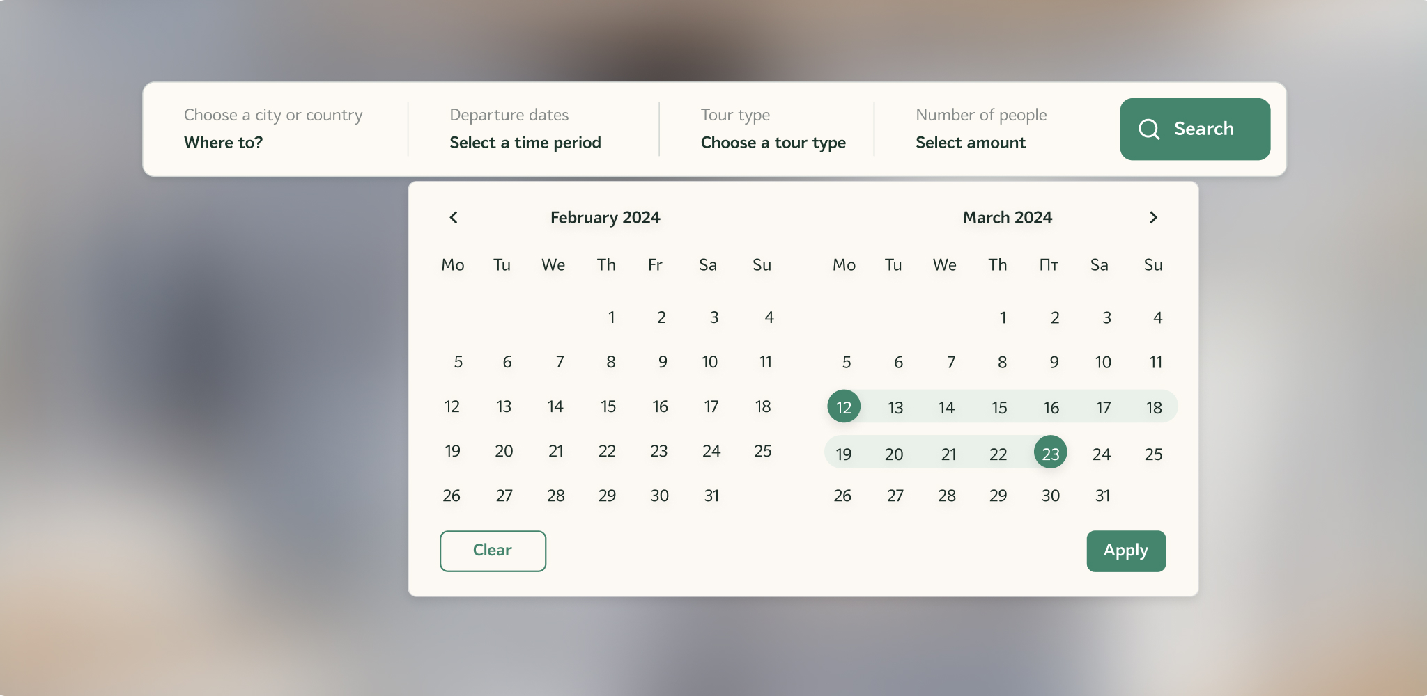
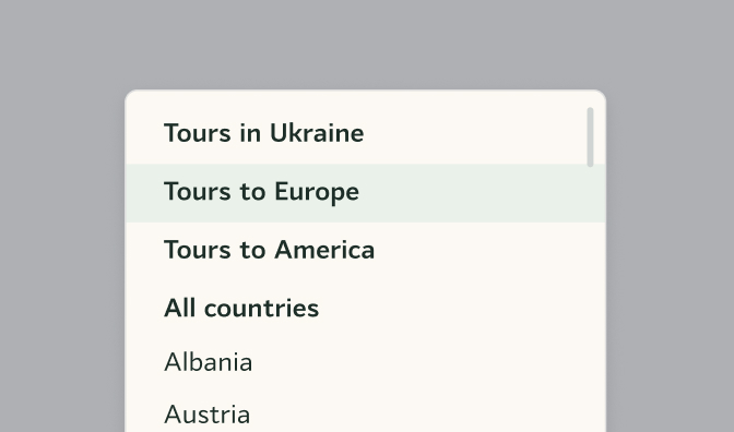
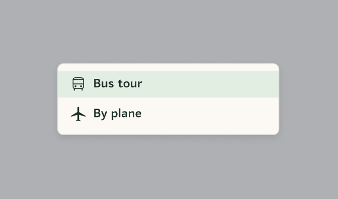
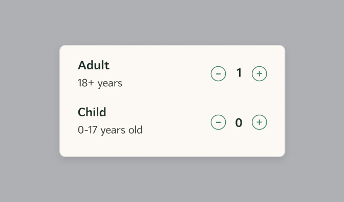
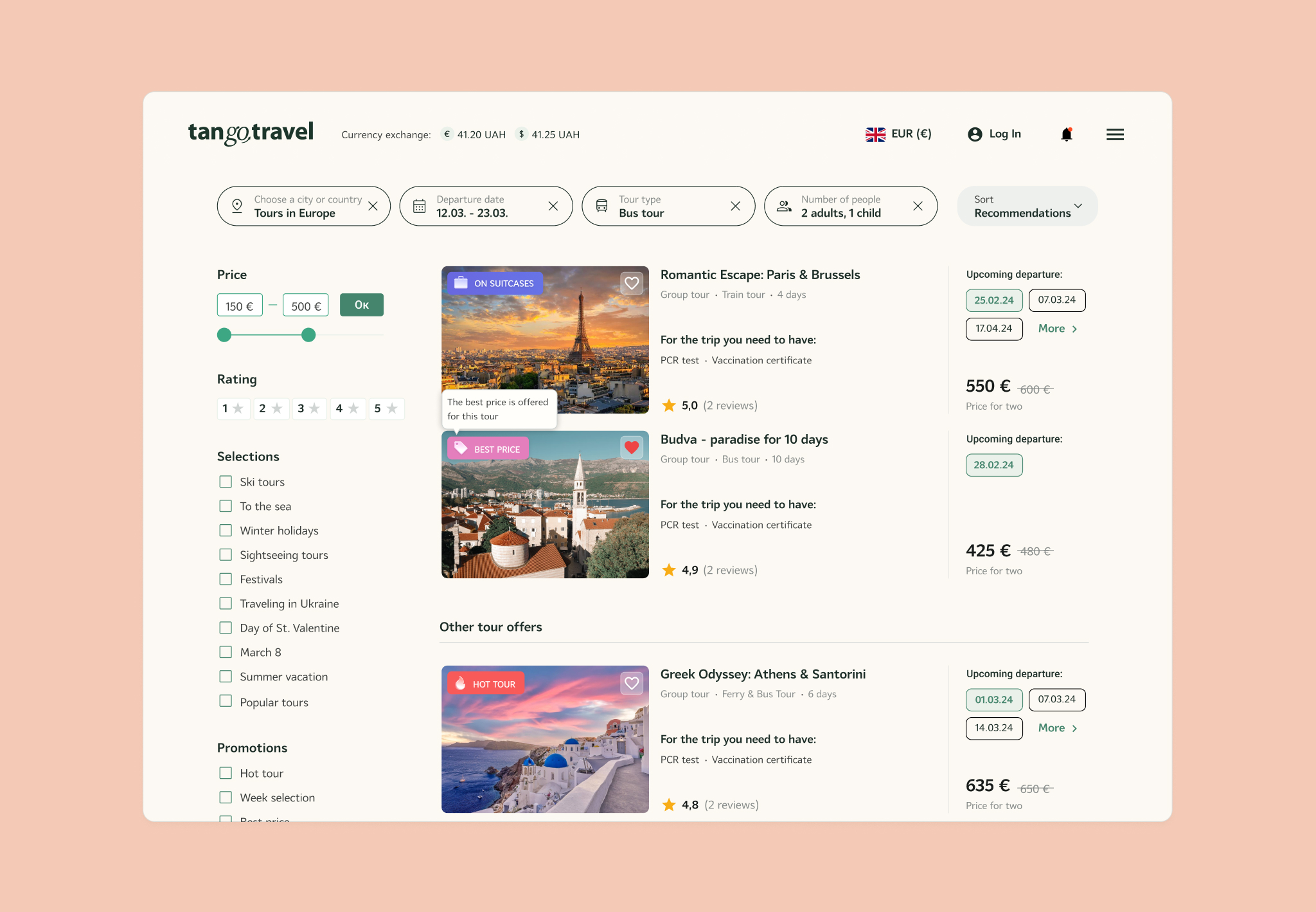
Search results now display key details at a glance: tour name, destination, price, availability, and customer ratings. Interactive filters help users refine their choices without overwhelming them.
Search Results
Search results now display key details at a glance: tour name, destination, price, availability, and customer ratings. Interactive filters help users refine their choices without overwhelming them.
Tour Page
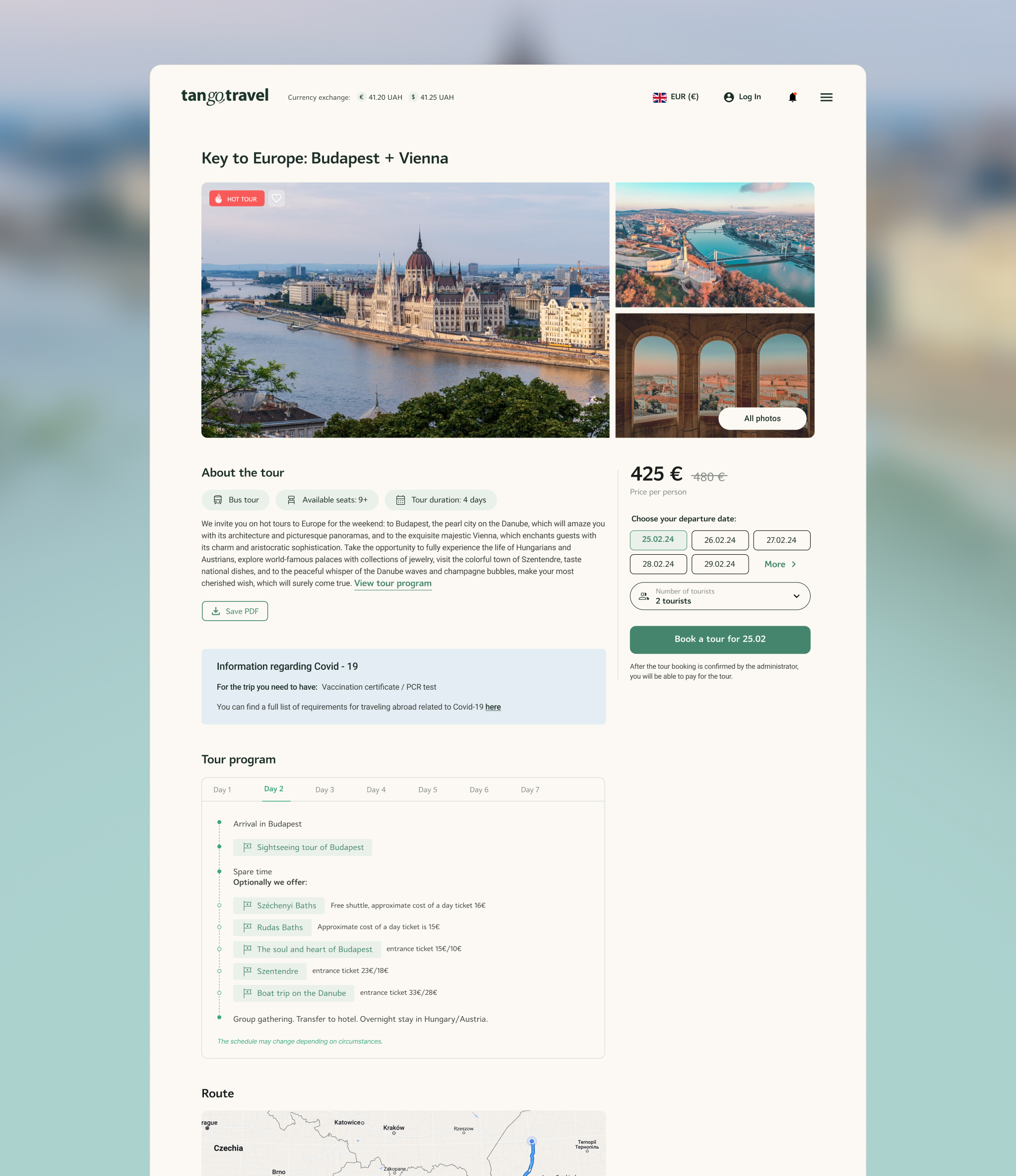
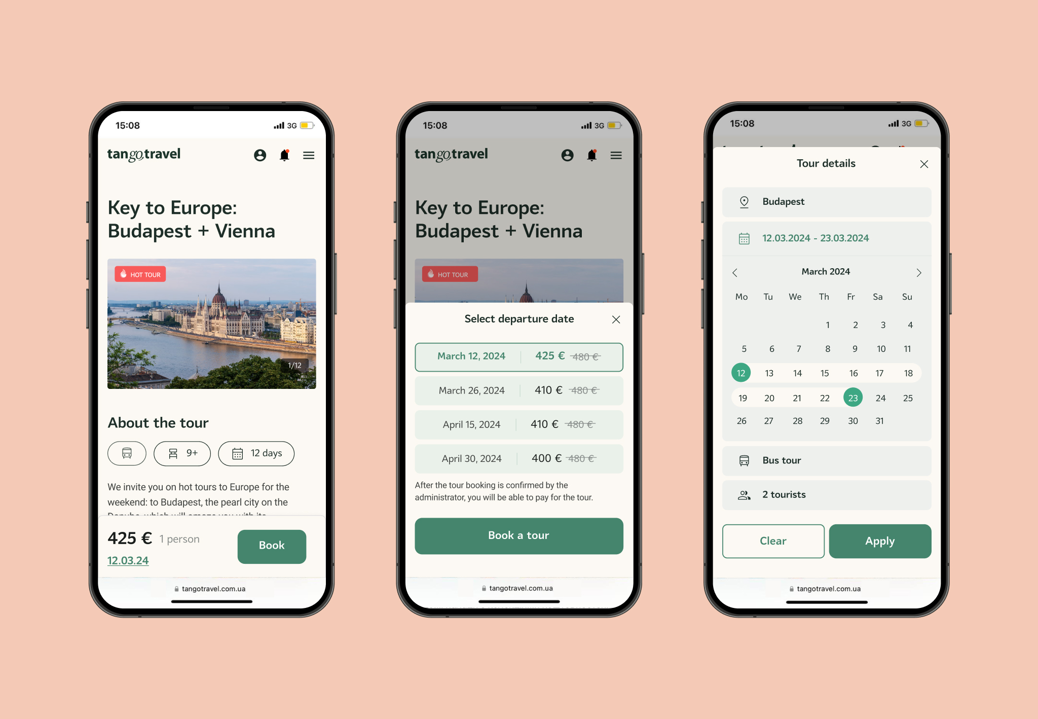
Each tour page features a rich visual gallery, detailed descriptions, itinerary highlights, and traveler reviews. The layout is optimized for clarity, ensuring users can make informed decisions quickly.
Tour Booking
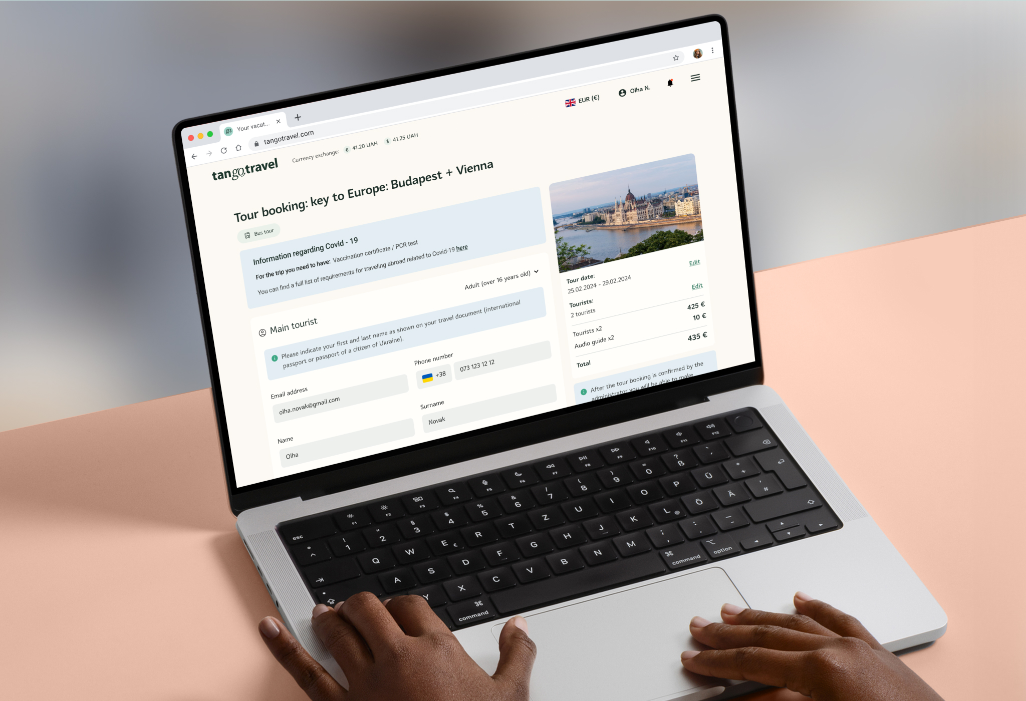
The booking flow was restructured for efficiency and clarity. Users can now select add-ons such as excursions or hotels, choose flexible payment options, and review their booking details in a structured format before finalizing.
Personal Cabinet
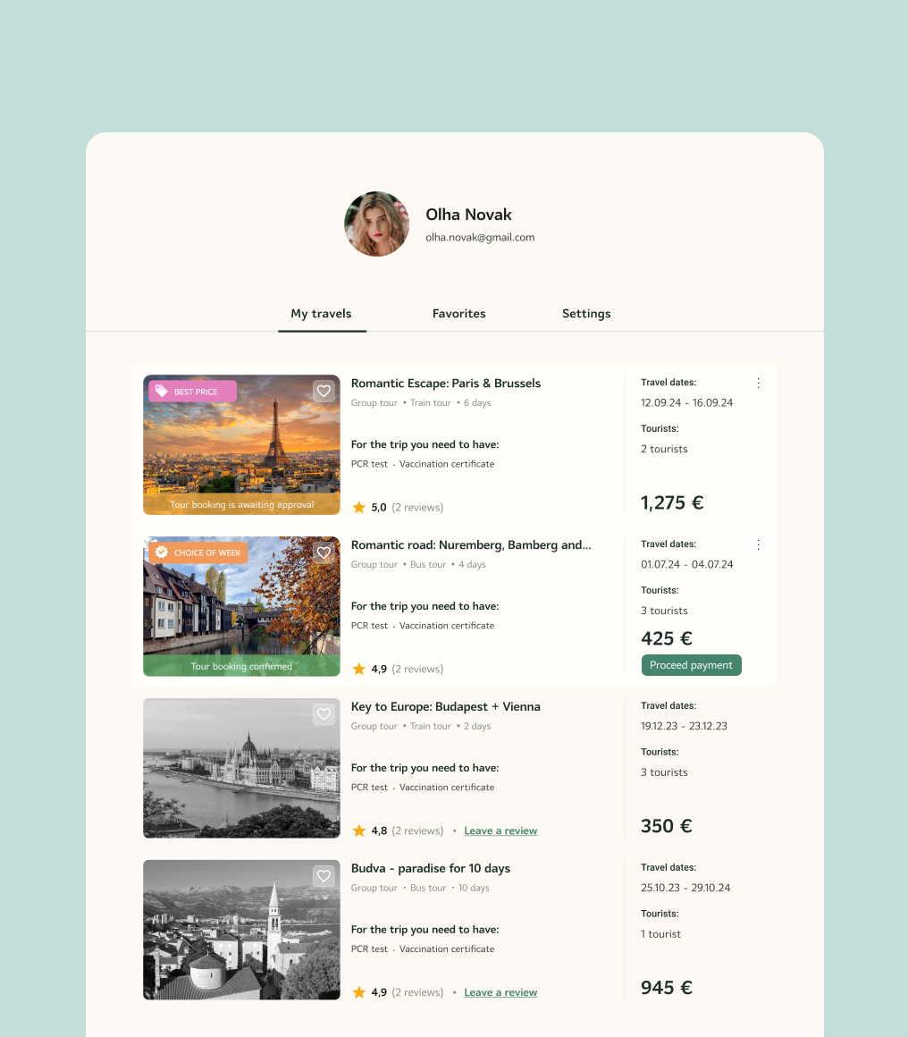
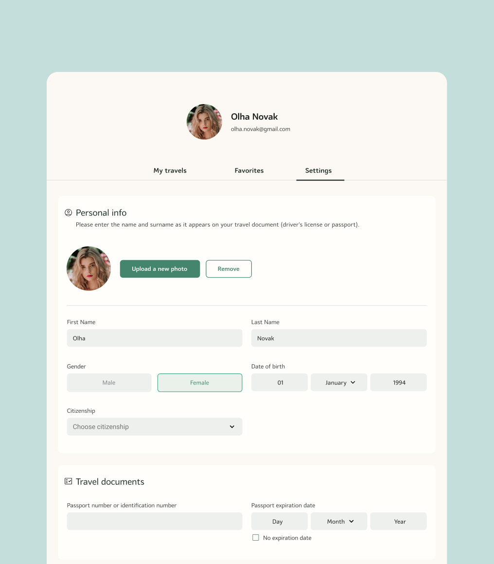
A redesigned user dashboard allows travelers to manage their bookings effortlessly. Upcoming and past trips are displayed in a structured table, with options to modify reservations and handle payments seamlessly.
Tour Review
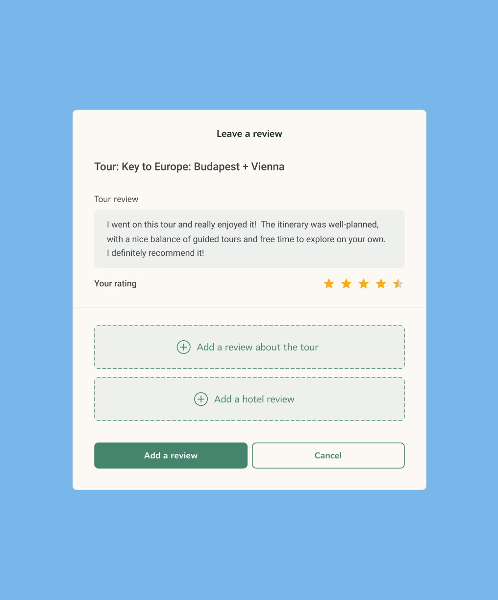
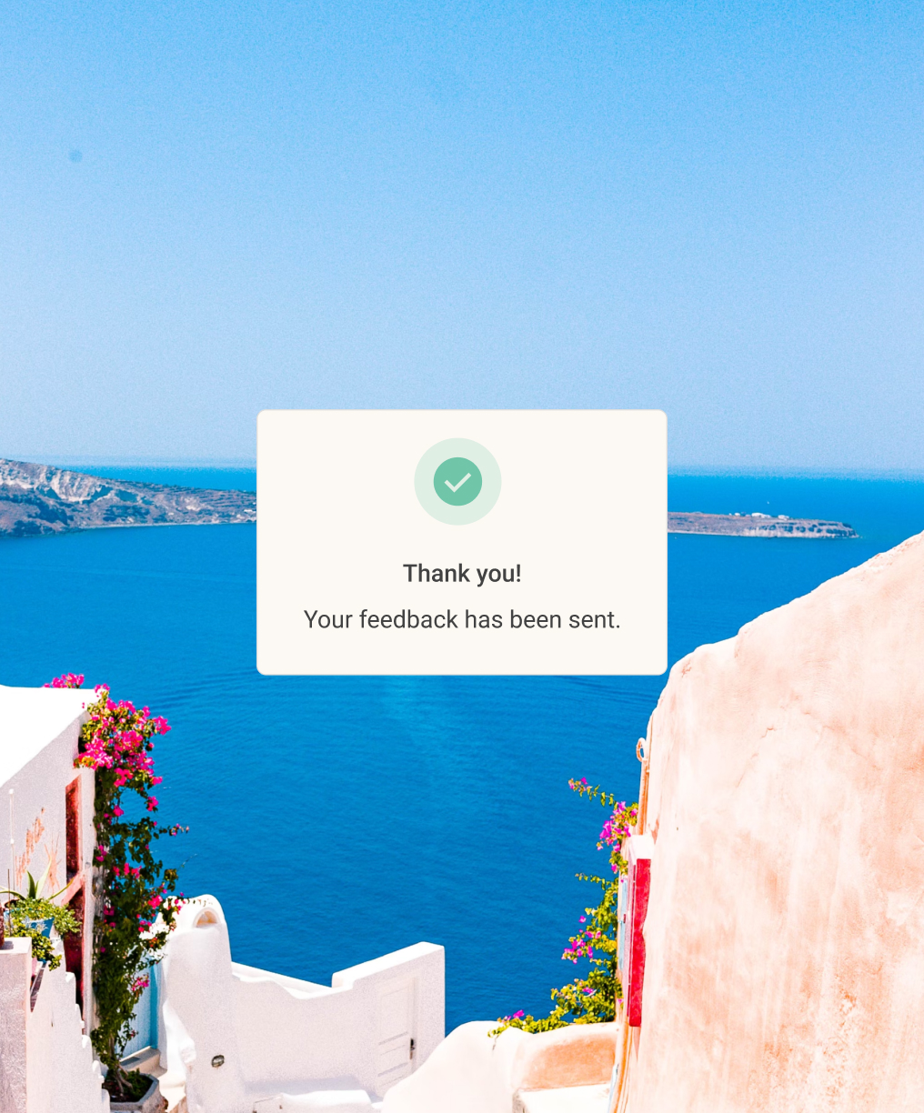
Users can now leave reviews with images, providing authentic feedback for future travelers. A structured format ensures credibility, while a rating system highlights top experiences.
About Us
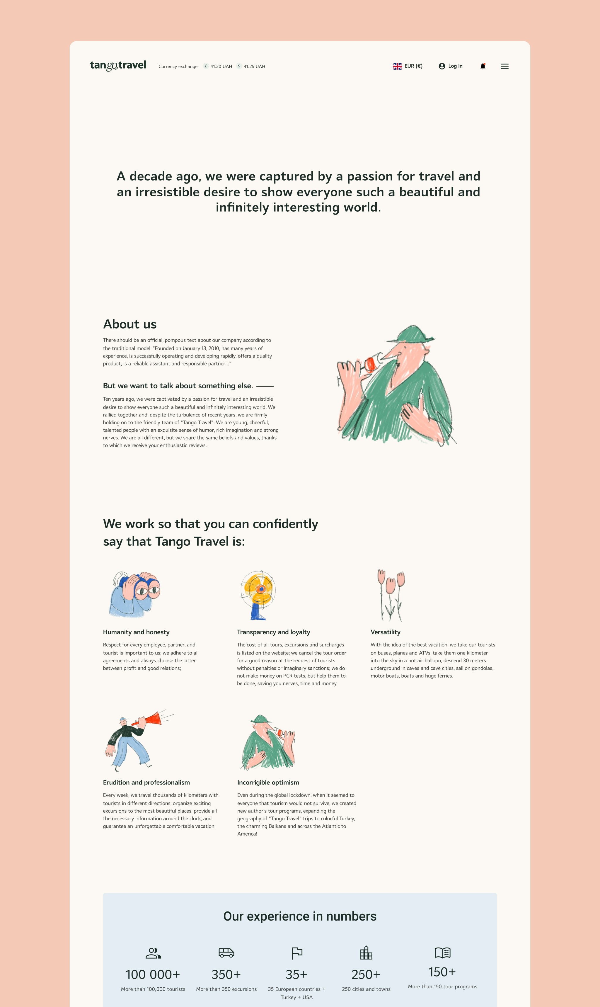
This section builds trust by presenting the company’s history, mission, and team. Testimonials further establish credibility, helping users feel confident in their choice of Tango Travel.
News
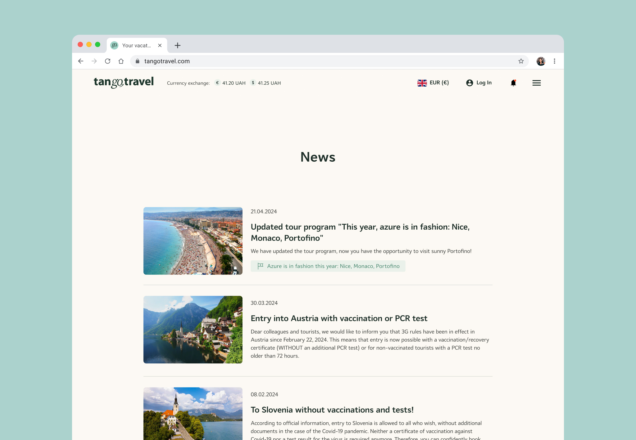
A dedicated news section keeps users informed about new tour launches, limited-time promotions, and important travel advisories.
Hotels
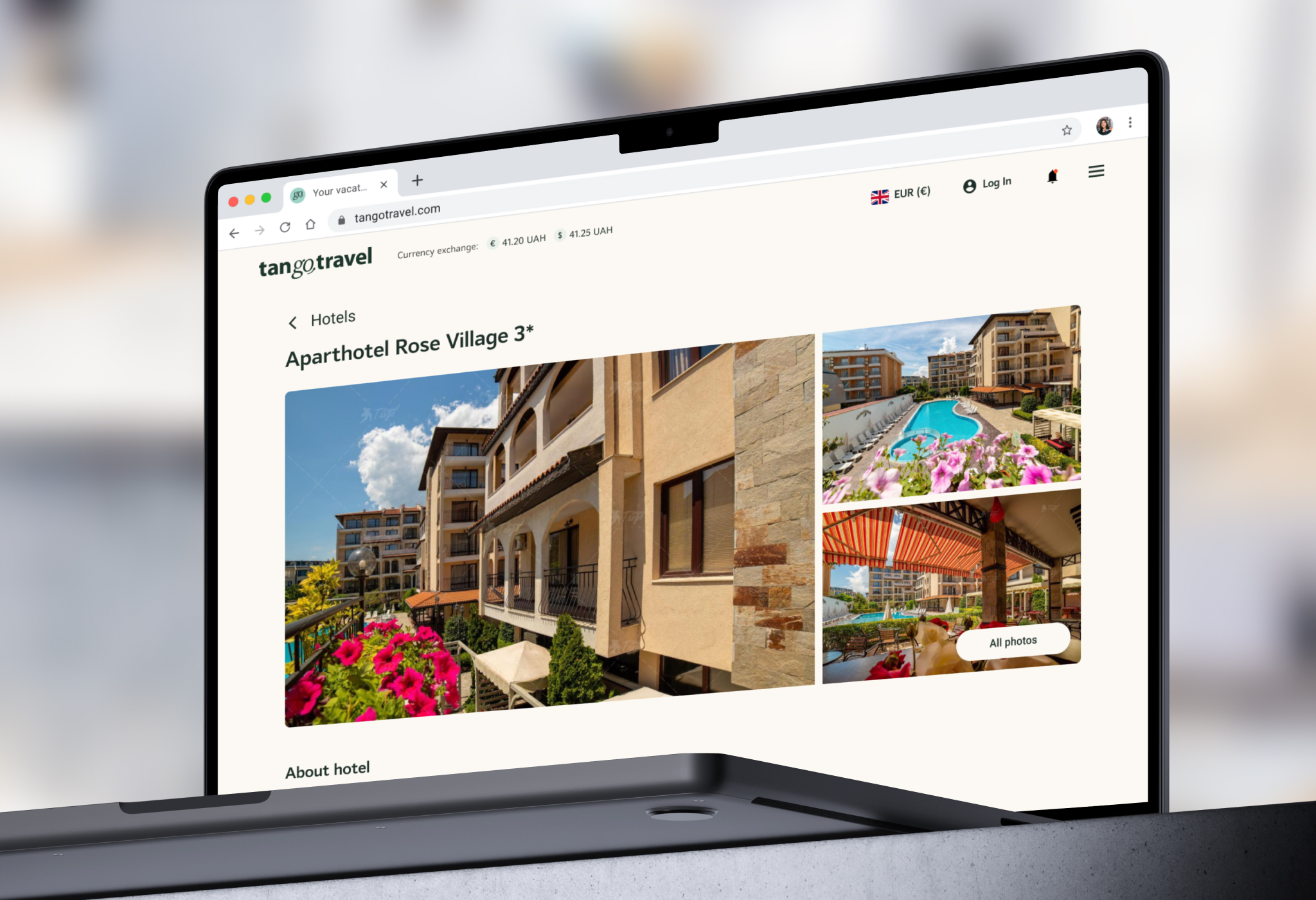
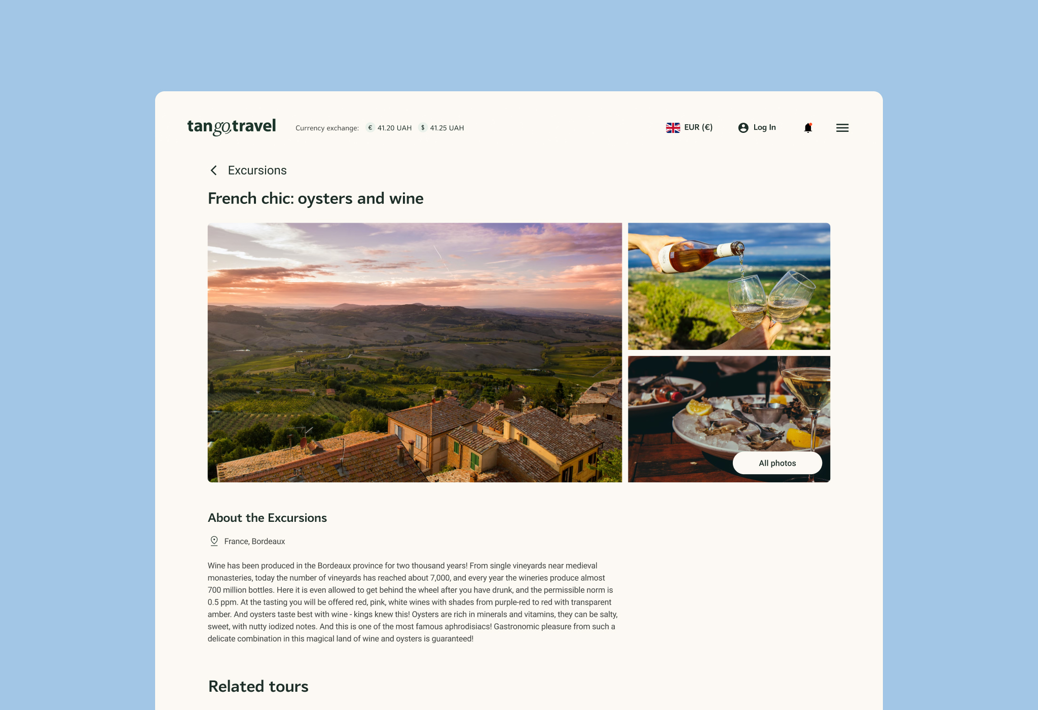
To enhance the travel experience, users can now browse and book accommodations and excursions directly through the platform, creating a seamless all-in-one booking experience.
Tour Agent: Booking Page
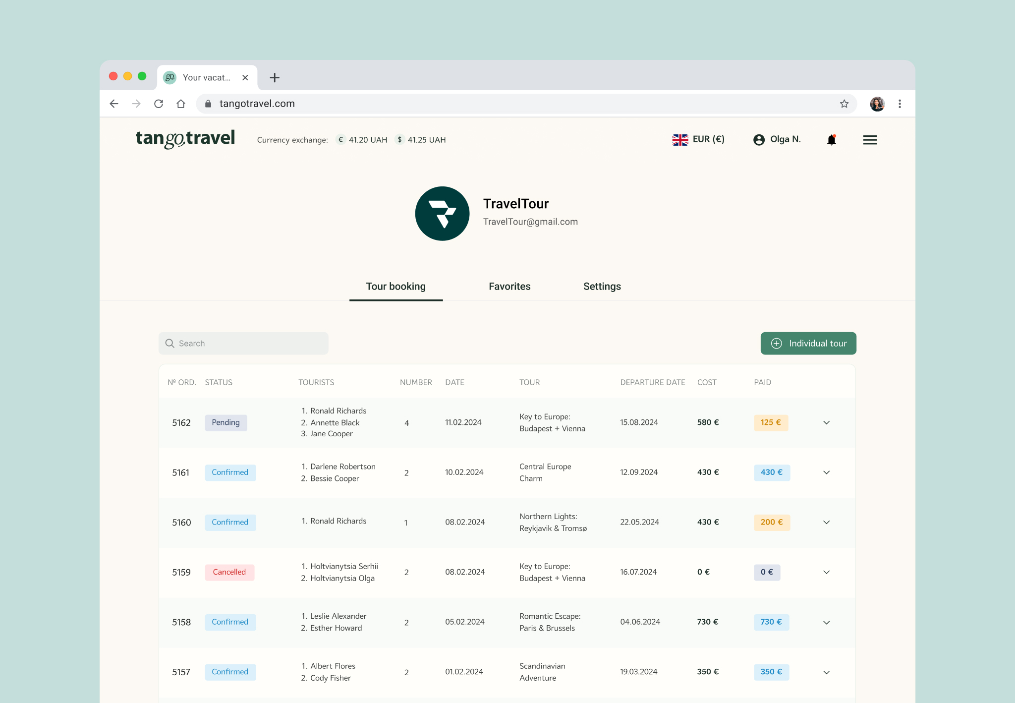
For tour agents managing multiple bookings, we designed a dedicated dashboard. A clear table view displays all reservations with statuses like pending, confirmed, or canceled. Payment details are also easily accessible, ensuring agents have full visibility and control.
Notifications
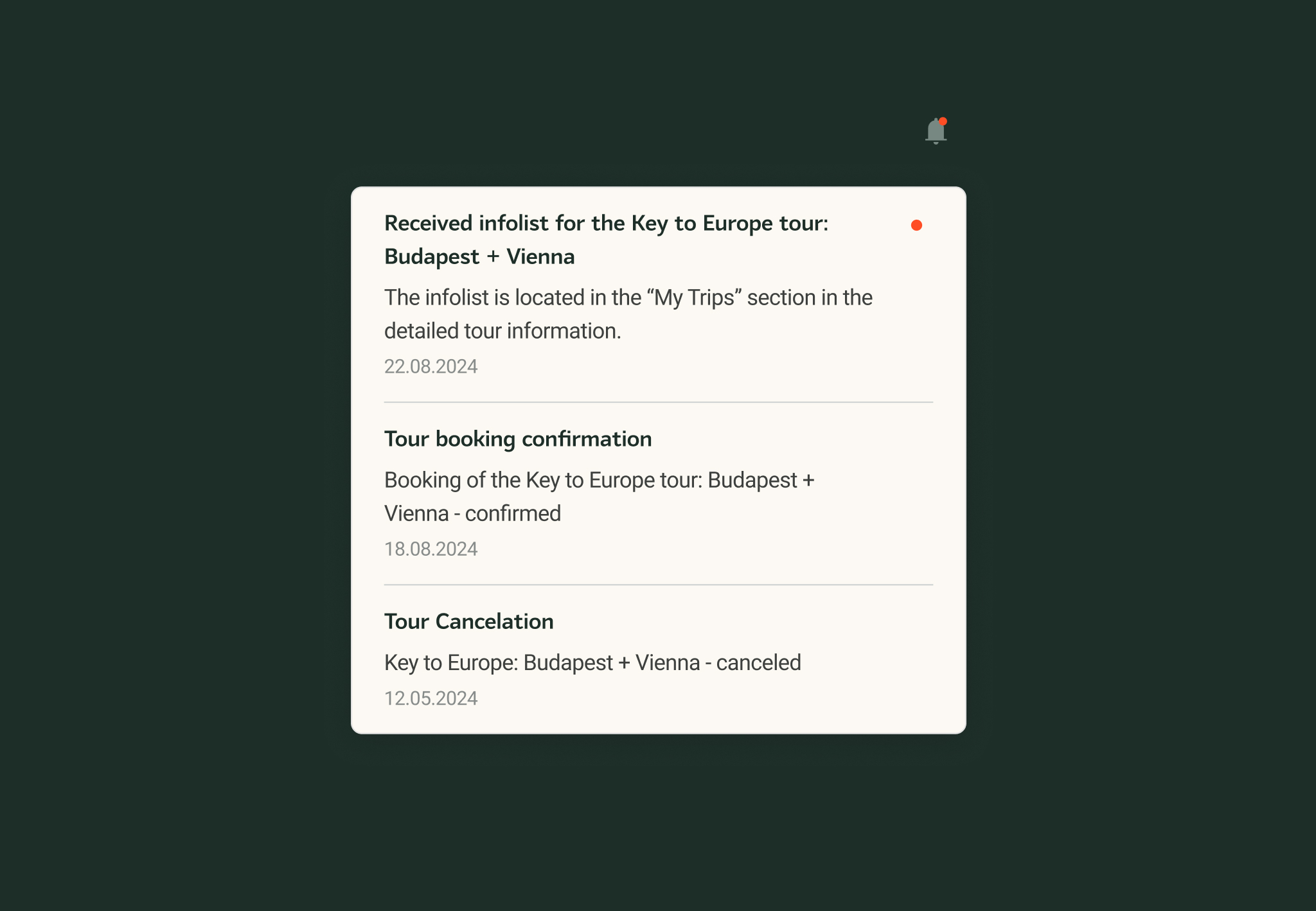
Real-time notifications keep users updated on booking confirmations, cancellations, and payment reminders. This feature is particularly valuable for tour agents, ensuring they stay informed at all times.
Mobile Responsiveness
Every screen is fully optimized for mobile use, ensuring a consistent and smooth booking experience across all devices.
[ Projects ]
Other projects
All cases

Convogrid.ai 🇸🇬
Designing a Platform for YouTube AI Conversational bots
AI, Chatbots, Creator Tools
View


Quillora 🇺🇸
Designing a Platform for AI-Driven SEO and Content Creation
AI, Copywriting, SEO, Marketing
View


Have a project in mind?
Contact us to discuss your goals, ask questions, and explore next steps.
Contact us


company

Projects

Services

About us

Contact us
Socials


Dribbble
Contact us

Send email

Book an intro call
Projects
Services
About us
Contact us
Tango Travel - Ukraine 🇺🇦
Modernizing the Tour Booking Experience
- Industries: Travel & Tourism, Booking
- Platforms: Web (Desktop & Mobile)
- Services: UI/UX Design, Branding, Marketing Assets
About: Tango Travel is a leading travel agency in Ukraine with over 12 years of experience, offering tours to more than 35 countries worldwide.
Challenge: The agency sought a fresh rebrand and an improved user experience to captivate a new target audience and modernize their digital presence
Approach: We conducted in-depth user research, uncovering key audience pain points and opportunities for enhancement. The result was a visually compelling and intuitive website, with optimized user paths and a revitalized brand identity.
Julia Bazhovska, Founder of TangoTravel
“Working with Efficy was a great experience. They understood our audience and transformed our brand and website into something modern, intuitive, and engaging. Their clarity in UX and creativity in design helped us refresh our digital presence and better connect with younger travelers.”
Design Process
We followed a structured process to ensure the best user experience. First, we conducted pre-sale research to understand the business goals and technical constraints. This was followed by in-depth user research, identifying the core audience and mapping an improved user flow.
Branding played a key role in shifting the company’s visual identity to a more mature and trustworthy look, while still retaining a touch of friendliness. Finally, we moved into prototyping, testing, and refining the final UI based on user feedback.
1.
Research & Exploration
- Stakeholder interviews
- Business research & competitor analysis
- User interviews
- User modeling & journey mapping
- User flows
- Low-fidelity wireframing
2.
Branding
- Visual direction exploration
- Client testing & discussions
- Final selection & branding guidelines
3.
Design & Prototyping
- High-fidelity screens
- Interactive prototypes
- Design system creation
- Ongoing collaboration with stakeholders & developers
Research & Exploration
Through our research, we discovered that Tango Travel’s primary audience was not “everyone,” but predominantly users aged 30–45, whose priorities centered around trust, clarity, and reliable guidance. This finding contrasted sharply with the platform’s previous festive visual style, which didn’t align with their expectations. By mapping the user journey and identifying pain points in the booking flow, we gained clear direction on how to refine both the visual language and overall user experience, making the platform more trustworthy, focused, and intuitive.
Wireframing & Iterations
The wireframes provided a structured foundation for the new design, and new functionality, focusing on intuitive navigation, streamlined booking flows, and clear content presentation. By testing and refining these early-stage layouts, we ensured a user-friendly experience, reducing friction in the booking process and making it easier for customers to find and book tours efficiently.
Before & After
The previous branding featured two dancing figures—vibrant and festive but lacking professionalism. We refined the identity with an elegant calligraphic typeface, creating a modern yet inviting look. To maintain warmth, we introduced custom illustrations across the website and marketing materials, ensuring both clarity and usability remained a priority.
From a user experience perspective, the redesign improved visual hierarchy and readability, making key information easier to scan. The refined color palette and structured layout enhanced trust and accessibility, ensuring users could navigate the platform effortlessly while still feeling engaged with the brand's personality.
Pages & Features

Registration
Previously, the full-page registration process felt overwhelming. We streamlined it into a modal window, allowing users to sign up without disrupting their flow. This small but effective change significantly improved usability and encouraged more registrations.
Main page
The redesigned main page balances aesthetics with usability. A clean layout and intuitive navigation create an inviting first impression, while a dynamic promo banner highlights top destinations. The improved searach function helps users find tours quickly and efficiently.
Search Results
Search results now display key details at a glance: tour name, destination, price, availability, and customer ratings. Interactive filters help users refine their choices without overwhelming them.
Search Results
Search results now display key details at a glance: tour name, destination, price, availability, and customer ratings. Interactive filters help users refine their choices without overwhelming them.
Tour Page
Each tour page features a rich visual gallery, detailed descriptions, itinerary highlights, and traveler reviews. The layout is optimized for clarity, ensuring users can make informed decisions quickly.
Tour Booking
The booking flow was restructured for efficiency and clarity. Users can now select add-ons such as excursions or hotels, choose flexible payment options, and review their booking details in a structured format before finalizing.
Personal Cabinet
A redesigned user dashboard allows travelers to manage their bookings effortlessly. Upcoming and past trips are displayed in a structured table, with options to modify reservations and handle payments seamlessly.
Tour Review
Users can now leave reviews with images, providing authentic feedback for future travelers. A structured format ensures credibility, while a rating system highlights top experiences.
About Us
This section builds trust by presenting the company’s history, mission, and team. Testimonials further establish credibility, helping users feel confident in their choice of Tango Travel.
News
A dedicated news section keeps users informed about new tour launches, limited-time promotions, and important travel advisories.
Hotels
To enhance the travel experience, users can now browse and book accommodations and excursions directly through the platform, creating a seamless all-in-one booking experience.
Tour Agent: Booking Page
For tour agents managing multiple bookings, we designed a dedicated dashboard. A clear table view displays all reservations with statuses like pending, confirmed, or canceled. Payment details are also easily accessible, ensuring agents have full visibility and control.
Notifications
Real-time notifications keep users updated on booking confirmations, cancellations, and payment reminders. This feature is particularly valuable for tour agents, ensuring they stay informed at all times.
Mobile Responsiveness
Every screen is fully optimized for mobile use, ensuring a consistent and smooth booking experience across all devices.
[ Projects ]
Other projects
All cases
Convogrid.ai 🇸🇬
Designing a Platform for YouTube AI Conversational bots
AI, Chatbots, Creator Tools
View

Quillora 🇺🇸
Designing a Platform for AI-Driven SEO and Content Creation
AI, Copywriting, SEO, Marketing
View

Have a project in mind?
Contact us to discuss your goals, ask questions, and explore next steps.
Contact us


company
Projects
Services
About us
Contact us
Socials
Dribbble
Contact us
Send email
Book an intro call
Projects
Services
About us
Contact us
Tango Travel - Ukraine 🇺🇦
Modernizing the Tour Booking Experience
- Industries: Travel & Tourism, Booking
- Platforms: Web (Desktop & Mobile)
- Services: UI/UX Design, Branding, Marketing Assets
About: Tango Travel is a leading travel agency in Ukraine with over 12 years of experience, offering tours to more than 35 countries worldwide.
Challenge: The agency sought a fresh rebrand and an improved user experience to captivate a new target audience and modernize their digital presence
Approach: We conducted in-depth user research, uncovering key audience pain points and opportunities for enhancement. The result was a visually compelling and intuitive website, with optimized user paths and a revitalized brand identity.
Julia Bazhovska, Founder of TangoTravel
“Working with Efficy was a great experience. They understood our audience and transformed our brand and website into something modern, intuitive, and engaging. Their clarity in UX and creativity in design helped us refresh our digital presence and better connect with younger travelers.”
Design Process
We followed a structured process to ensure the best user experience. First, we conducted pre-sale research to understand the business goals and technical constraints. This was followed by in-depth user research, identifying the core audience and mapping an improved user flow.
Branding played a key role in shifting the company’s visual identity to a more mature and trustworthy look, while still retaining a touch of friendliness. Finally, we moved into prototyping, testing, and refining the final UI based on user feedback.
1.
Research & Exploration
- Stakeholder interviews
- Business research & competitor analysis
- User interviews
- User modeling & journey mapping
- User flows
- Low-fidelity wireframing
2.
Branding
- Visual direction exploration
- Client testing & discussions
- Final selection & branding guidelines
3.
Design & Prototyping
- High-fidelity screens
- Interactive prototypes
- Design system creation
- Ongoing collaboration with stakeholders & developers
Research & Exploration
Through our research, we discovered that Tango Travel’s primary audience was not “everyone,” but predominantly users aged 30–45, whose priorities centered around trust, clarity, and reliable guidance. This finding contrasted sharply with the platform’s previous festive visual style, which didn’t align with their expectations. By mapping the user journey and identifying pain points in the booking flow, we gained clear direction on how to refine both the visual language and overall user experience, making the platform more trustworthy, focused, and intuitive.
Wireframing & Iterations
The wireframes provided a structured foundation for the new design, and new functionality, focusing on intuitive navigation, streamlined booking flows, and clear content presentation. By testing and refining these early-stage layouts, we ensured a user-friendly experience, reducing friction in the booking process and making it easier for customers to find and book tours efficiently.
Before & After
The previous branding featured two dancing figures—vibrant and festive but lacking professionalism. We refined the identity with an elegant calligraphic typeface, creating a modern yet inviting look. To maintain warmth, we introduced custom illustrations across the website and marketing materials, ensuring both clarity and usability remained a priority.
From a user experience perspective, the redesign improved visual hierarchy and readability, making key information easier to scan. The refined color palette and structured layout enhanced trust and accessibility, ensuring users could navigate the platform effortlessly while still feeling engaged with the brand's personality.
Pages & Features

Registration
Previously, the full-page registration process felt overwhelming. We streamlined it into a modal window, allowing users to sign up without disrupting their flow. This small but effective change significantly improved usability and encouraged more registrations.
Main page
The redesigned main page balances aesthetics with usability. A clean layout and intuitive navigation create an inviting first impression, while a dynamic promo banner highlights top destinations. The improved searach function helps users find tours quickly and efficiently.
Search Results
Search results now display key details at a glance: tour name, destination, price, availability, and customer ratings. Interactive filters help users refine their choices without overwhelming them.
Search Results
Search results now display key details at a glance: tour name, destination, price, availability, and customer ratings. Interactive filters help users refine their choices without overwhelming them.
Tour Page
Each tour page features a rich visual gallery, detailed descriptions, itinerary highlights, and traveler reviews. The layout is optimized for clarity, ensuring users can make informed decisions quickly.
Tour Booking
The booking flow was restructured for efficiency and clarity. Users can now select add-ons such as excursions or hotels, choose flexible payment options, and review their booking details in a structured format before finalizing.
Personal Cabinet
A redesigned user dashboard allows travelers to manage their bookings effortlessly. Upcoming and past trips are displayed in a structured table, with options to modify reservations and handle payments seamlessly.
Tour Review
Users can now leave reviews with images, providing authentic feedback for future travelers. A structured format ensures credibility, while a rating system highlights top experiences.
About Us
This section builds trust by presenting the company’s history, mission, and team. Testimonials further establish credibility, helping users feel confident in their choice of Tango Travel.
News
A dedicated news section keeps users informed about new tour launches, limited-time promotions, and important travel advisories.
Hotels
To enhance the travel experience, users can now browse and book accommodations and excursions directly through the platform, creating a seamless all-in-one booking experience.
Tour Agent: Booking Page
For tour agents managing multiple bookings, we designed a dedicated dashboard. A clear table view displays all reservations with statuses like pending, confirmed, or canceled. Payment details are also easily accessible, ensuring agents have full visibility and control.
Notifications
Real-time notifications keep users updated on booking confirmations, cancellations, and payment reminders. This feature is particularly valuable for tour agents, ensuring they stay informed at all times.
Mobile Responsiveness
Every screen is fully optimized for mobile use, ensuring a consistent and smooth booking experience across all devices.
[ Projects ]
Other projects
All cases

Convogrid.ai 🇸🇬
Designing a Platform for YouTube AI Conversational bots
AI, Chatbots, Creator Tools
View
Quillora 🇺🇸
Designing a Platform for AI-Driven SEO and Content Creation
AI, Copywriting, SEO, Marketing
View

Have a project in mind?
Contact us to discuss your goals, ask questions, and explore next steps.
Contact us

company
Projects
Services
About us
Contact us
Socials
Dribbble
Contact us
Send email
Book an intro call